
Tinybots Design System
In 2015, I co-founded the company Tinybots. As the lead designer I designed Tessa; a small social robot that supports people with cognitive disabilities and their families. Tessa is a small, talking robot that speaks friendly reminders, which family members can write and schedule via an easy-to-use app.
To standardize the frontend design process, I created the Tinybots Design System, that standardized different components of the interface using symbols and components in Sketch.
I designed Tinybots' branding, logomark and logotype. The font is a variation of my custom designed font Polygon. The logomark is an iconic representation of the same design language used in the robot embodiments. Simple, quirky, but also friendly and approachable.
The challenge to unify principles of design into a single system was that it combined many different aspects. It is a combination of hardware, user interfaces, conversational interactions, physical packaging, instruction manuals, and many other facets.
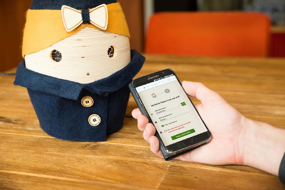
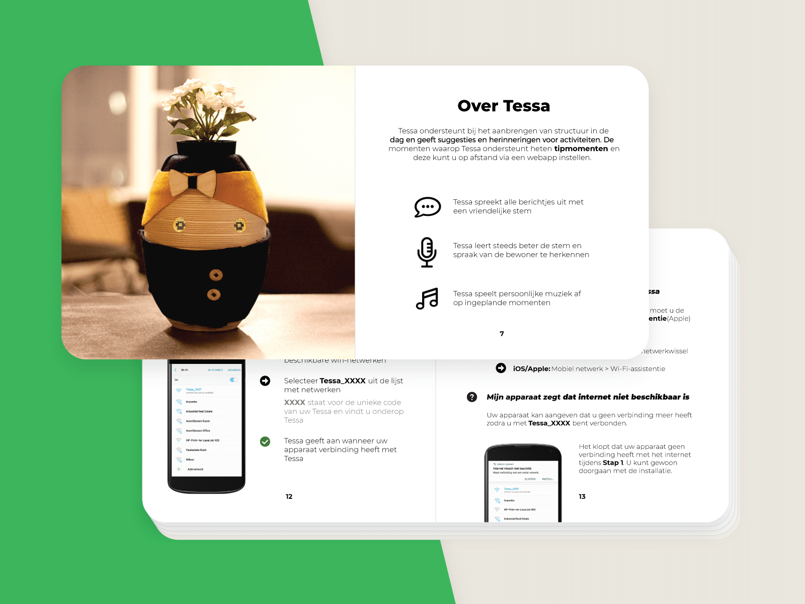
Tessa's connect WiFi interface during the installation process
To make sure there was consistent user experience throughout all designed, I created the following UX principles for Tessa:
- Support the user in progressing, so they always know what the next step is (feedforward)
- Constructive and destructive actions always give feedback, so the user knows what happened
- Validation happens at the end, so the user does not get warnings mid-progress
- Related input operations happen on the same screen, so the user always is aware of the context
- Always consider at least 3 alternatives for each flow (first-time use, regular-use, and power-use)
- Experiences are continuous, they are an on-going process
- What Tessa does or says is made explicit, so the user knows exactly what the robot does
- Instructions are always communicated from Tessa's perspective
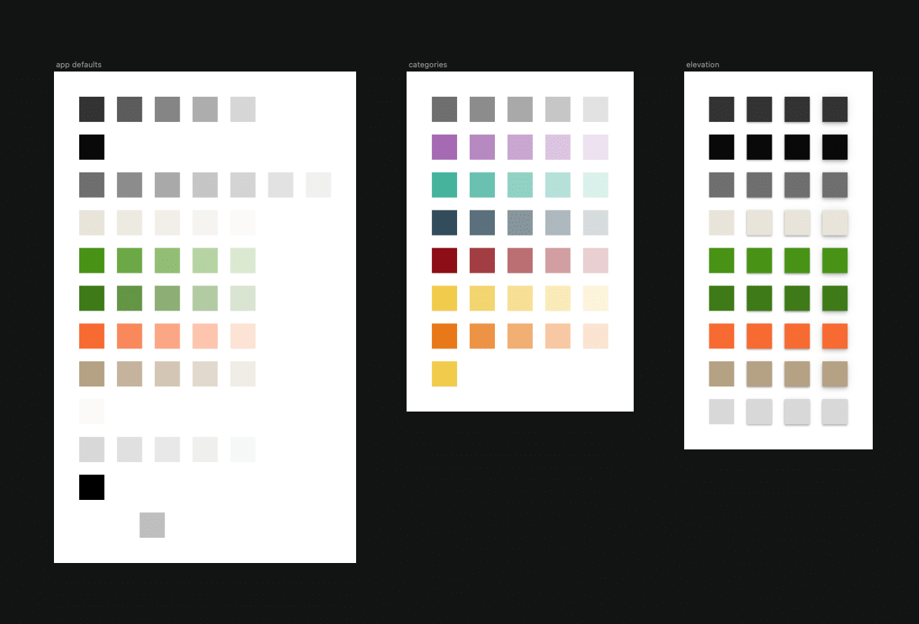
The colors, embedded in the Sketch component library
The design system included preset definitions for color, typography, specific components for the interface, and symbols. All of these were build as a component library in Sketch, so components could be easily updated and maintained.
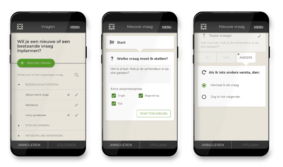
The motivational script feature extensively used the design system
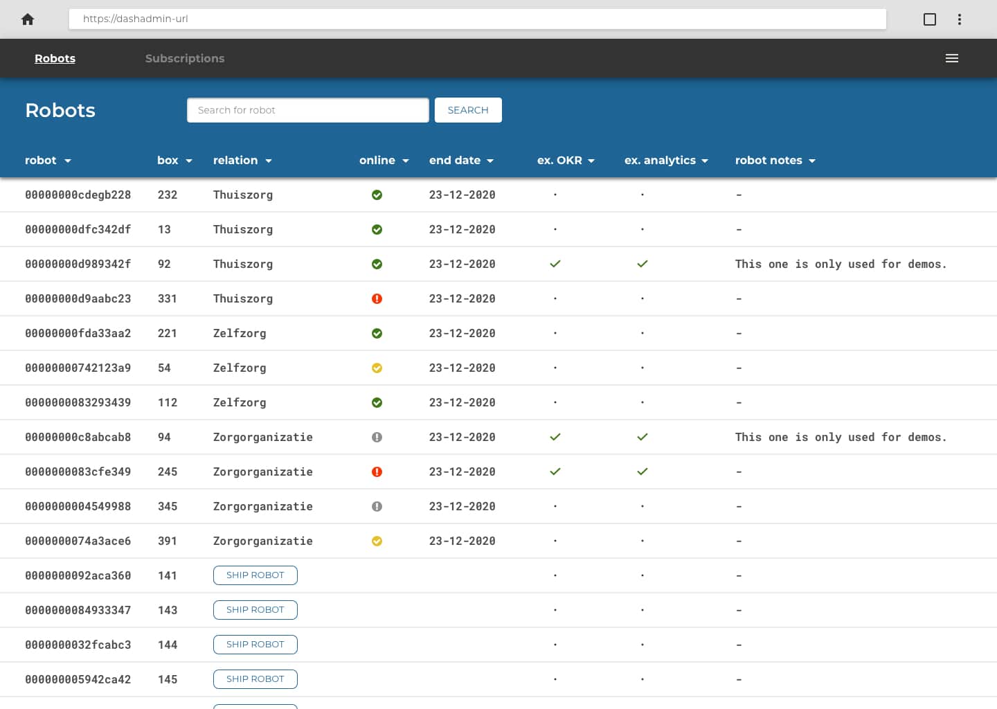
The design system was also used for the administrative dashboard
Even Tessa's user manual was designed according to similar principles of the design system
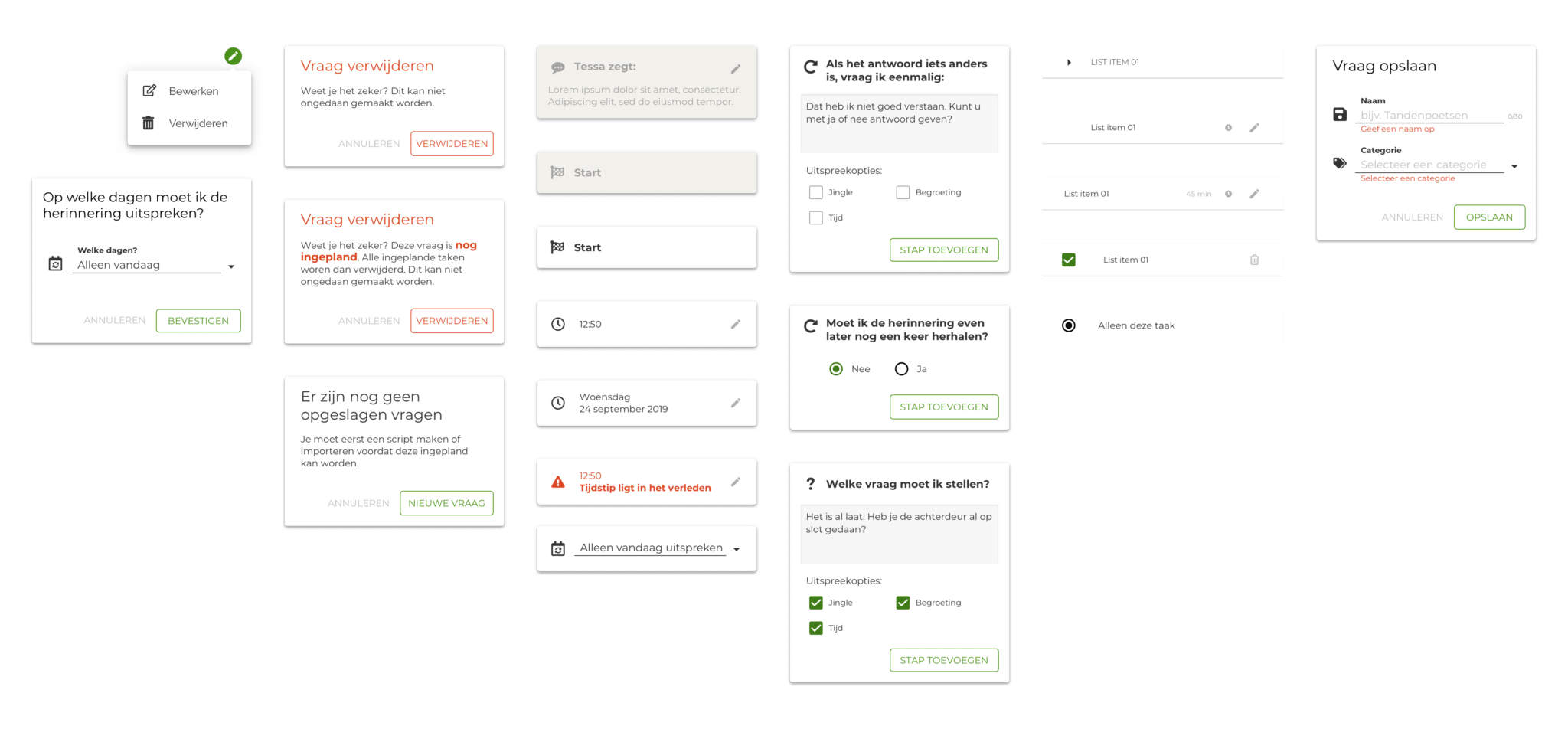
Overall, the Sketch component library contained over 80 different components: modals, cards, menus, navigation, and basic interface components such as buttons and selects. With each new project, existing components were updated and new components added to keep the design system up-to-date.
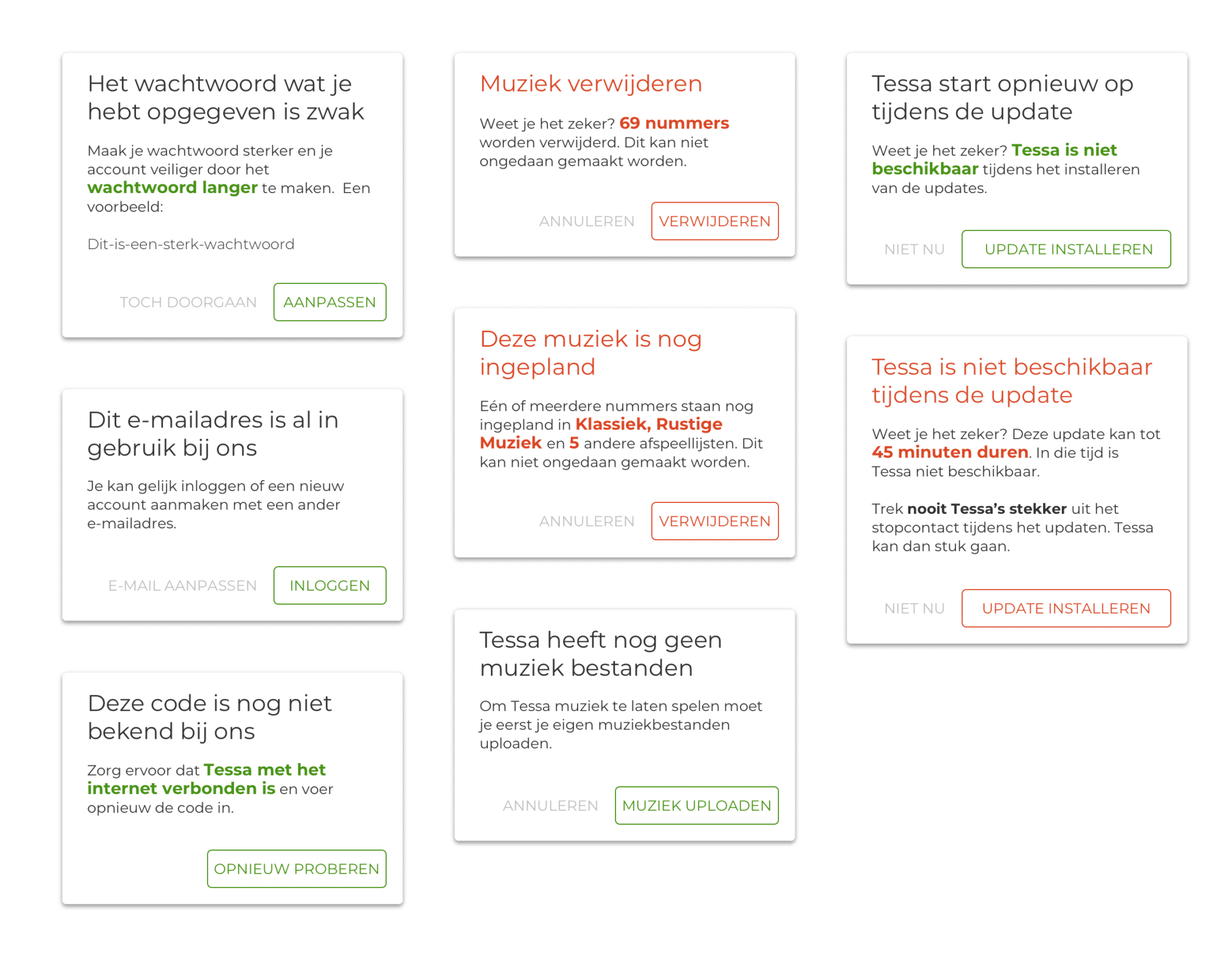
A subset of different modals used in Tessa's app