
Atrias Design System
Atrias is the key information provider for the energy sector in Belgium, which needed to streamline their design process. The Atrias Design System (ADS) was designed to be the common design language for all digital experiences with Atrias.
The Atrias Design System is the foundation that helps create great new experiences & interfaces for all new and existing Atrias projects. The ADS includes design guidelines, a Figma component library, and a React package to kickstart new projects within Atrias.
The ADS is designed and developed for 3 different audiences at Atrias:
For designers
The ADS provides guidelines for creating new interfaces and digital experiences that are consistent and in line with the Atrias product portfolio.
For developers
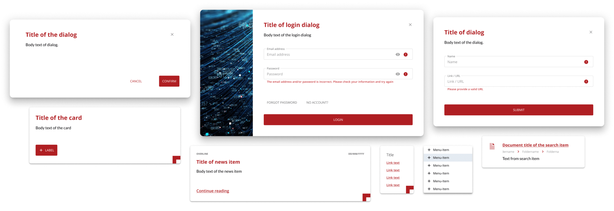
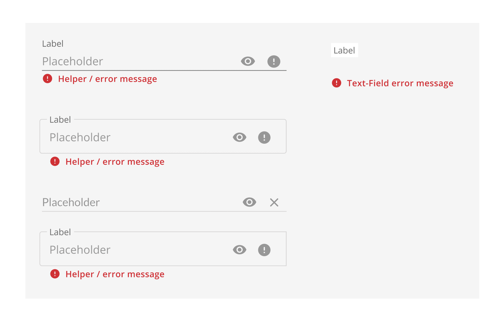
The ADS contains ready-to-use UI components offered as a React package and is complete with code and styling, as well as examples on how to apply them directly.
For everybody else
The ADS has resources for logos, Atrias stock images, a bespoke icon set, and different MS Word and PowerPoint templates.
The ADS is internally available as a SharePoint, which is accessible to all employees and the primary means of documentation within Atrias. This also means everybody internally has access to the ADS and that it is easy to share, update and expand the ADS by anyone in the future. No technical expertise is necessary to update the ADS.
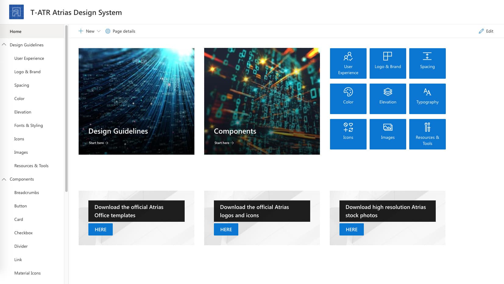
The structure of the ADS and how it is available to the organization: design guidelines & specific components
The ADS is not limited to guidelines on user interfaces (UI), it also contains guidelines and resources related to the Atrias logo & branding and document templates. It contains a set of overarching design principles, constraints, code libraries and best practices as input for consistent designs and user experiences.
The guidelines of the ADS are explained by simple do's and don'ts to illustrate how to apply the principle.
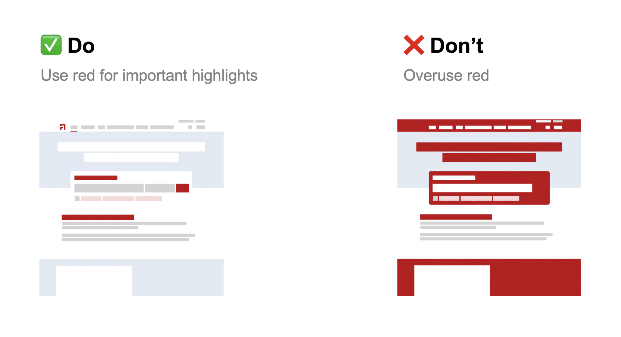
Practical do's & don'ts of color usage in Atrias UI design
The ADS is based on several principles of Google Material Design, but is developed to be stylistically different. The ADS reflects the Atrias brand and goal. To make sure guidelines are respected and make the design process more fluent, a Figma library has been created with standard Atrias components.
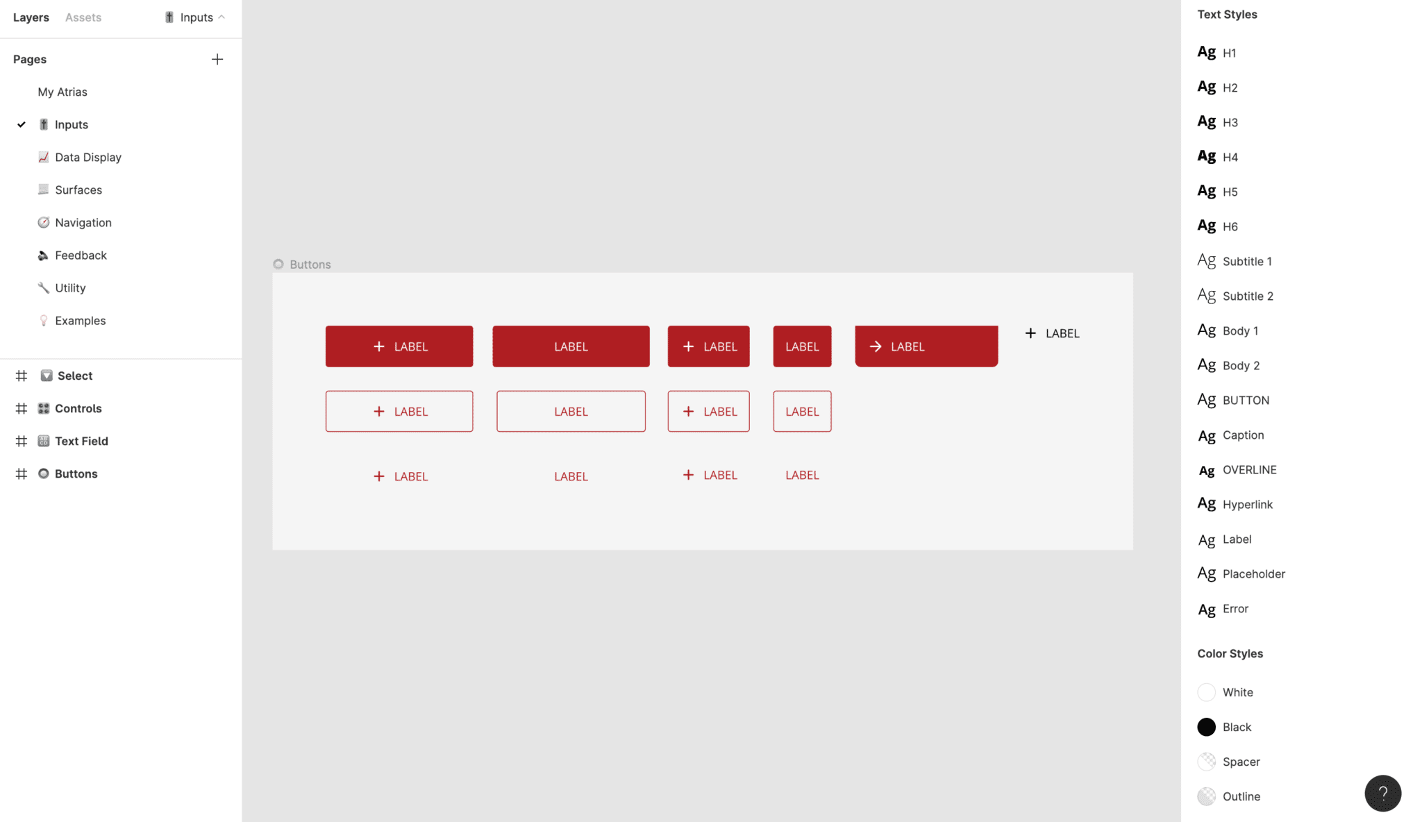
ADS structure inside of Figma
Together with the development team, we also developed a React component library to ensure common components such as Typography, Colors, Buttons, and Input Fields are ready-to-use. This maintains consistency in design, ensures a single source of truth, as well as drastically speed up development time.
Component examples in Figma that also have a React counterpart
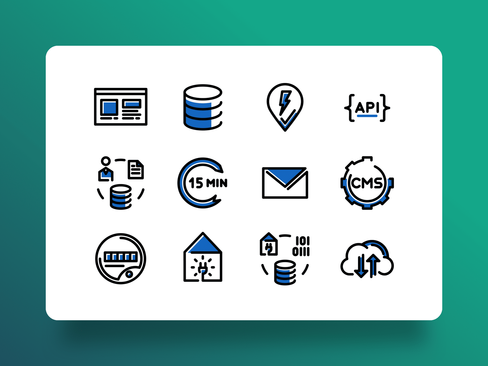
Atrias has a very specific set of functional domains, which required custom icons to be used in official documentations. These icons are energy sector specific and several examples can be found below; including Infeed, Billing, Reconciliation, and Allocation.
Custom domain specific icons, designed for Atrias
Custom technology specific icons; designed for Atrias
Finally, the ADS was developed in parallel with the redesign of the Atrias public website. This allowed for a variety of test cases and to see if the ADS could handle them. Additionally, with the public website in place, there is now a live example in place of the ADS.
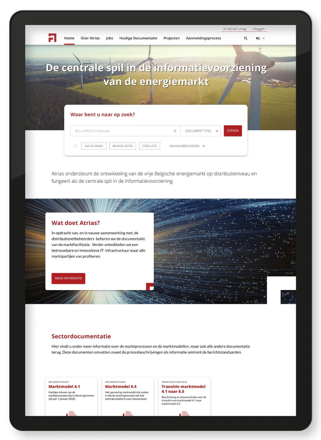
The Atrias Design System in practice for the Atrias public practice